LeapFrogBI now offers project navigation via interactive graph visualizations! Simply go to any component and you will be presented with a graph representing the upstream and downstream components related to the selected components.

Want more detail? No problem – check the “Extended Map” option and the graph will display all related components recursively.
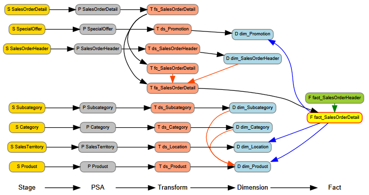
Still not enough? Click the data flow diagram button to view your entire project’s data flow!
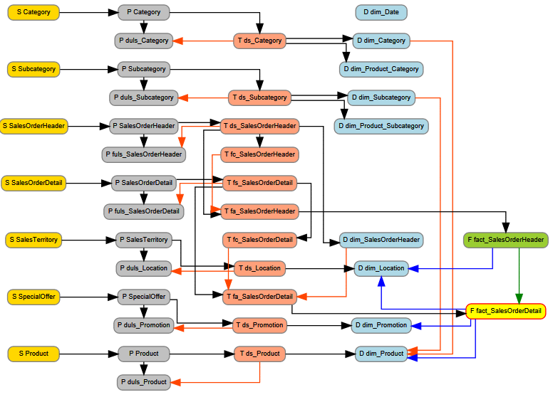
We’ve gone this far… Why stop now? Click the dimensional model button to generate the current status of your project’s dimension and fact relationships.
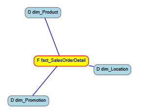
Enjoy! Remember…All of the nodes are clickable. Just click on the node that you want to focus on & you’ll be brought to that component. Also, the links are color codes to represent different types of relationships; foreign key, lineage, join, … The selected component will always be highlighted. Node colors represent component types.
